A layout built to scale
The existing card layout gave each automation a large, spacious row — comfortable, but only a few fit on screen at once and there was no room to grow.
What Changed
I redesigned the manage tab as a table: a compact row per automation with dedicated columns for the automation, who created it, the related project(s), and an active toggle. The denser layout fits far more on screen, scans faster, aligns with the table patterns used elsewhere in the product, and — critically — leaves room to surface more metadata over time by turning columns on and off, rather than overwhelming a card. I tested the new table against the original cards in an unmoderated preference study (50 respondents) to confirm the direction before building.
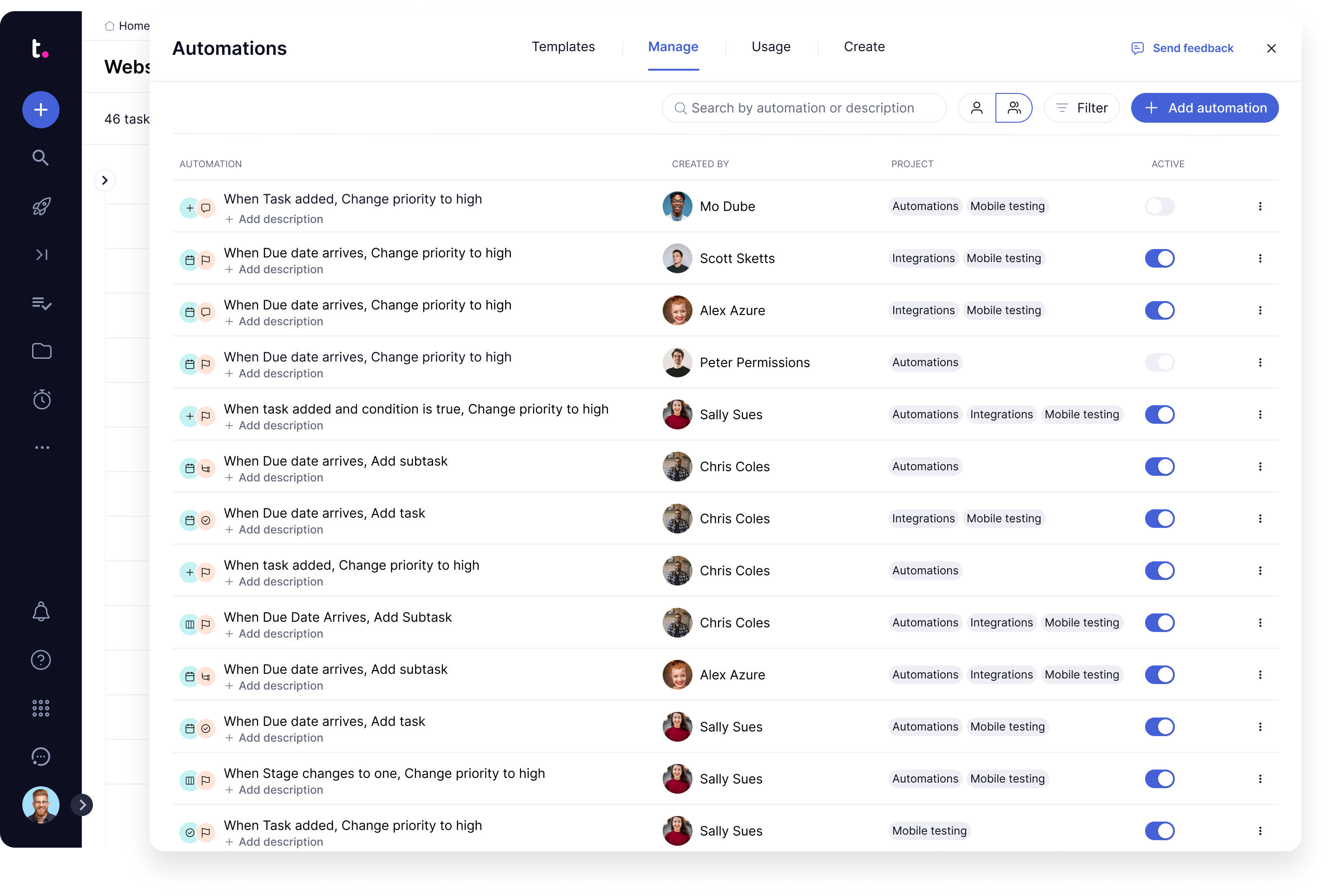
Before — the original card layout
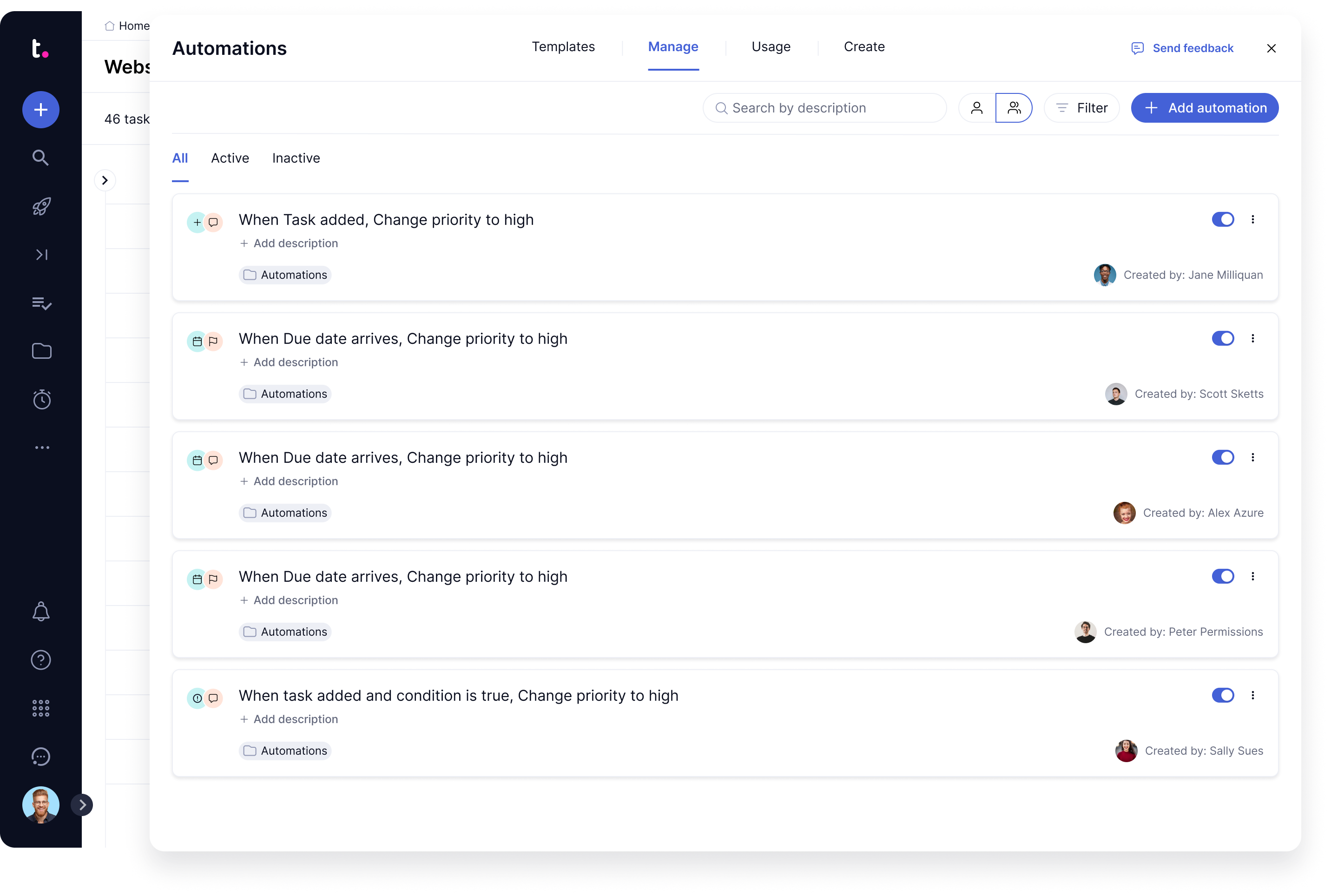
After — the redesigned table layout